


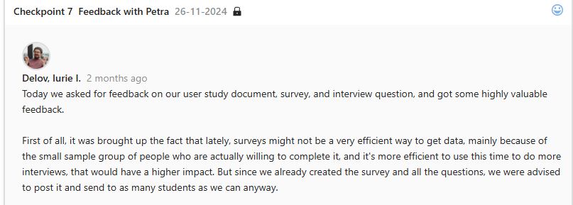
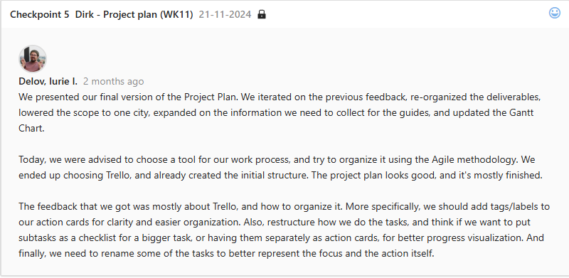
Bento Box Grid Layout
What I wanted to do
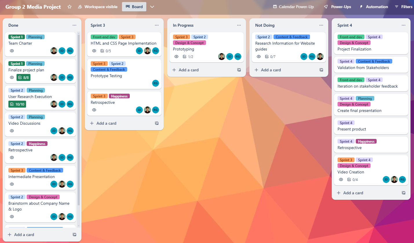
Initially, I wanted to structure my learning outcomes a little bit more interesting than going to a different page, and having just text and images. That led me to brainstorm and research different portfolios, layouts, and styles. Eventually I found information about Bento Box Grid, which seems to be very trendy and popular today.
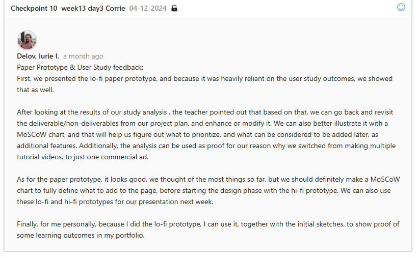
What I did
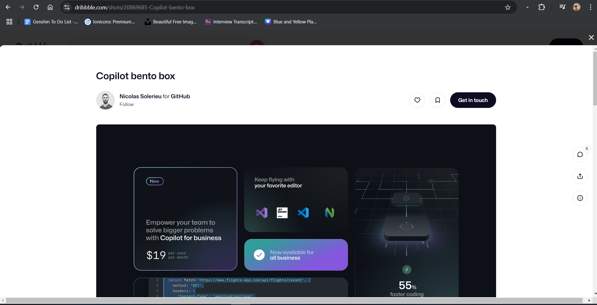
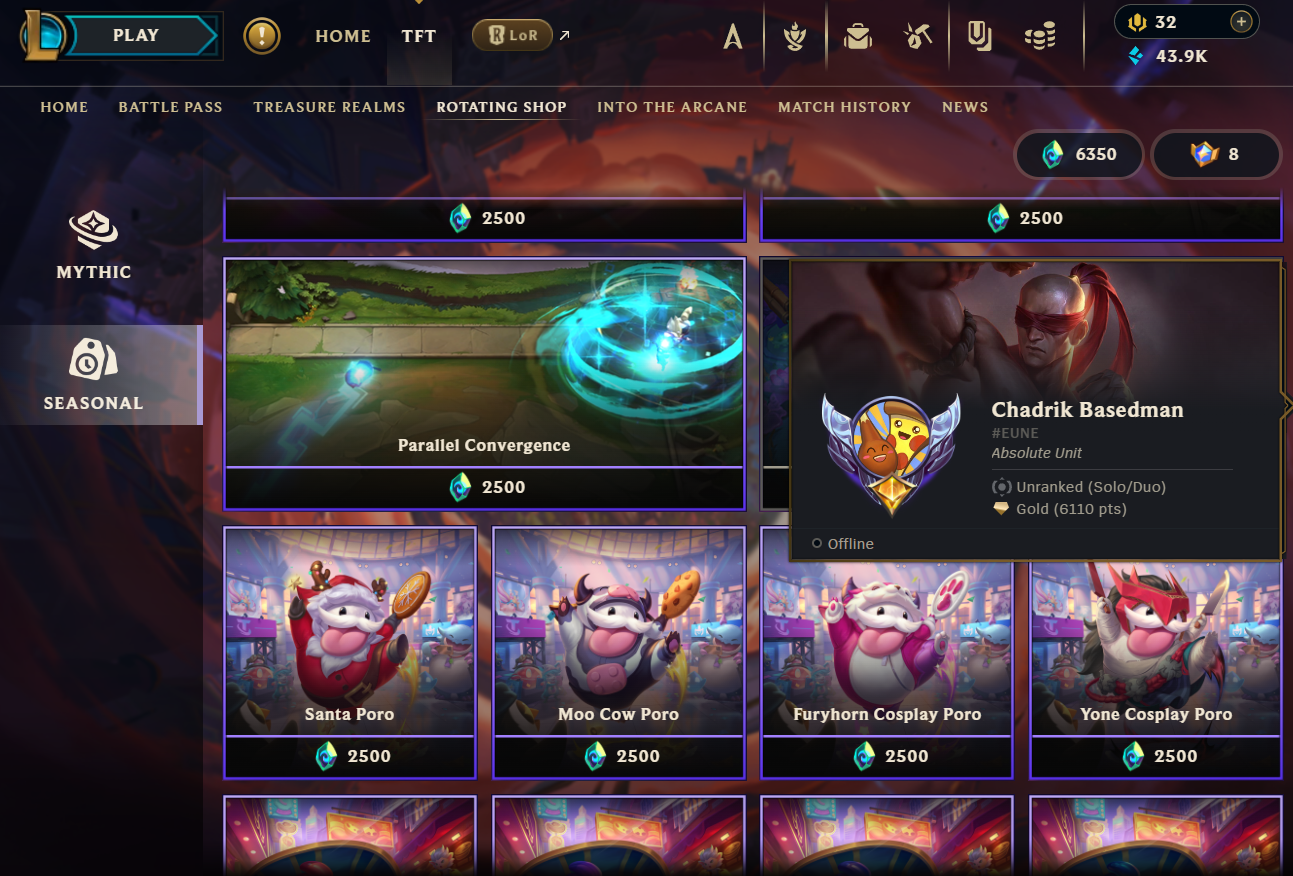
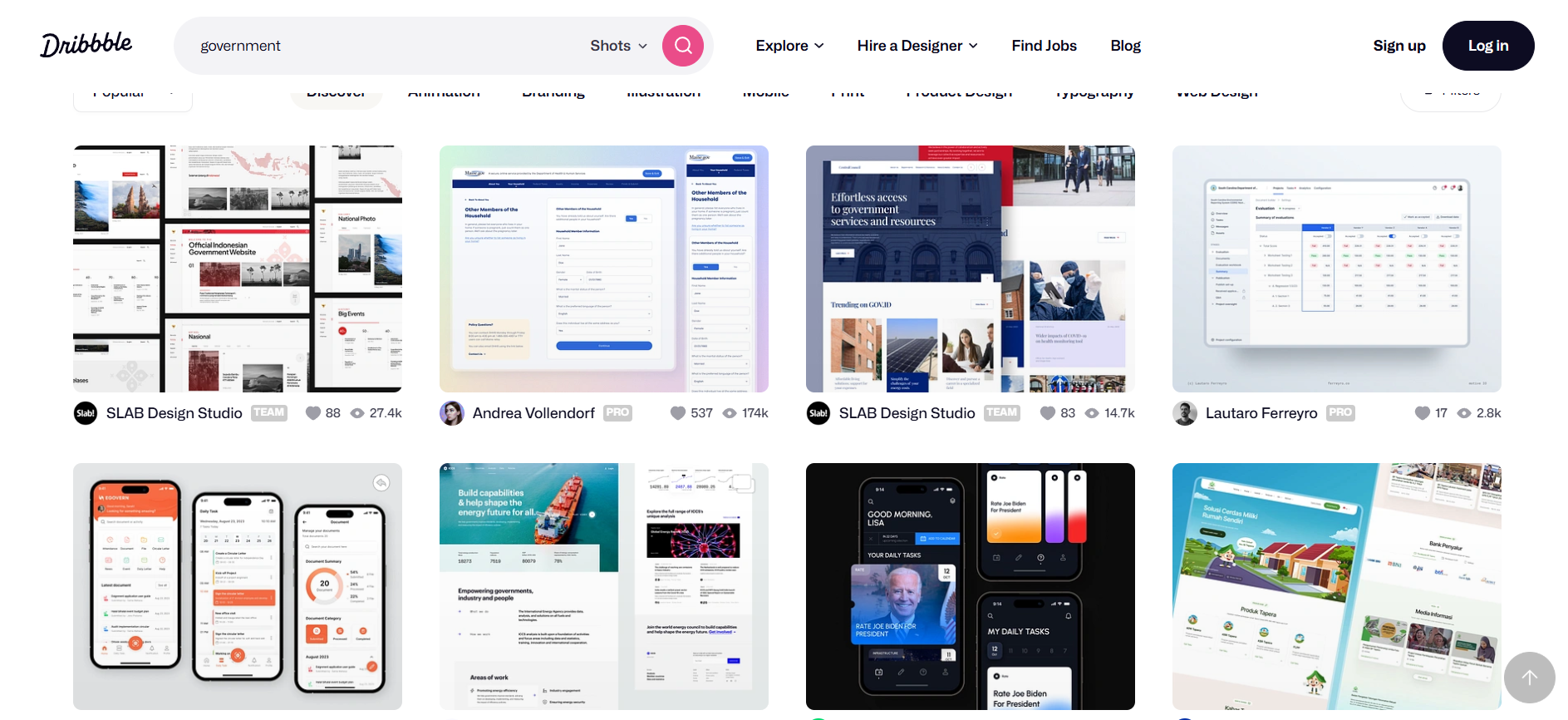
Again, the first step was research, and finding out as many examples as I can with Bento Box Grids. I took inspiration from Dribbble, League of Legends in-game store, and just plain old Google. Each card of the grid would represent a learning outcome, and when combined, it would form a cohesive block of cards. The general idea was clear, but now I had to decide if I want to do it using Flexbox or CSS Grid. Eventually I decided to use Flexbox, and with the help of some YouTube tutorials, mainly the one by How to Web Dev, I managed to create a simple, plain bento grid. Now, the next problem, was how would I display the information for each card. After some more research, I decided that the best way to do it would be a modal window that would open after clicking the image on the card, similar to Dribbble.


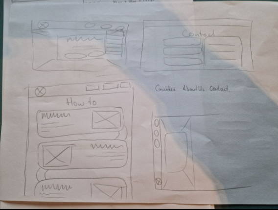
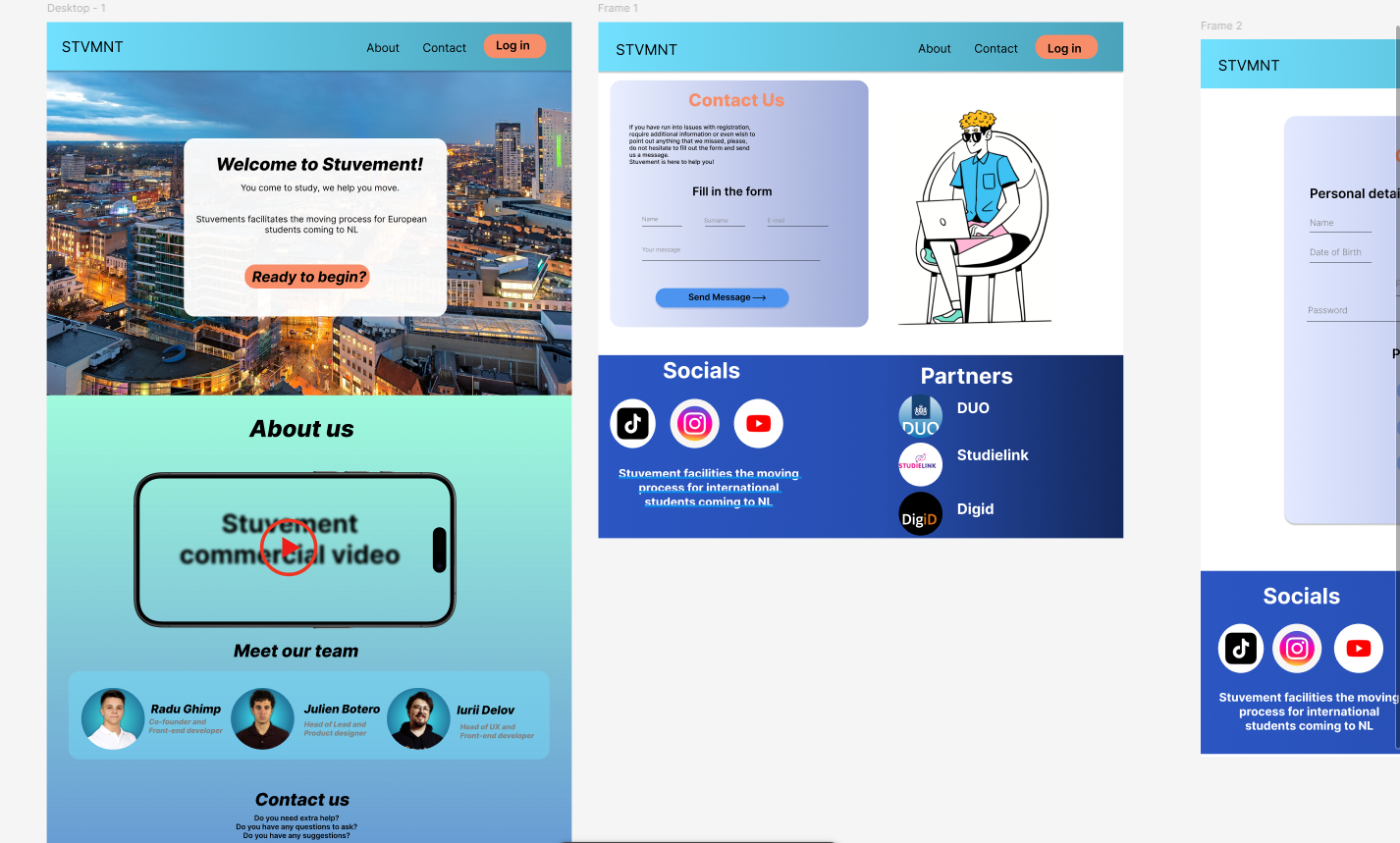
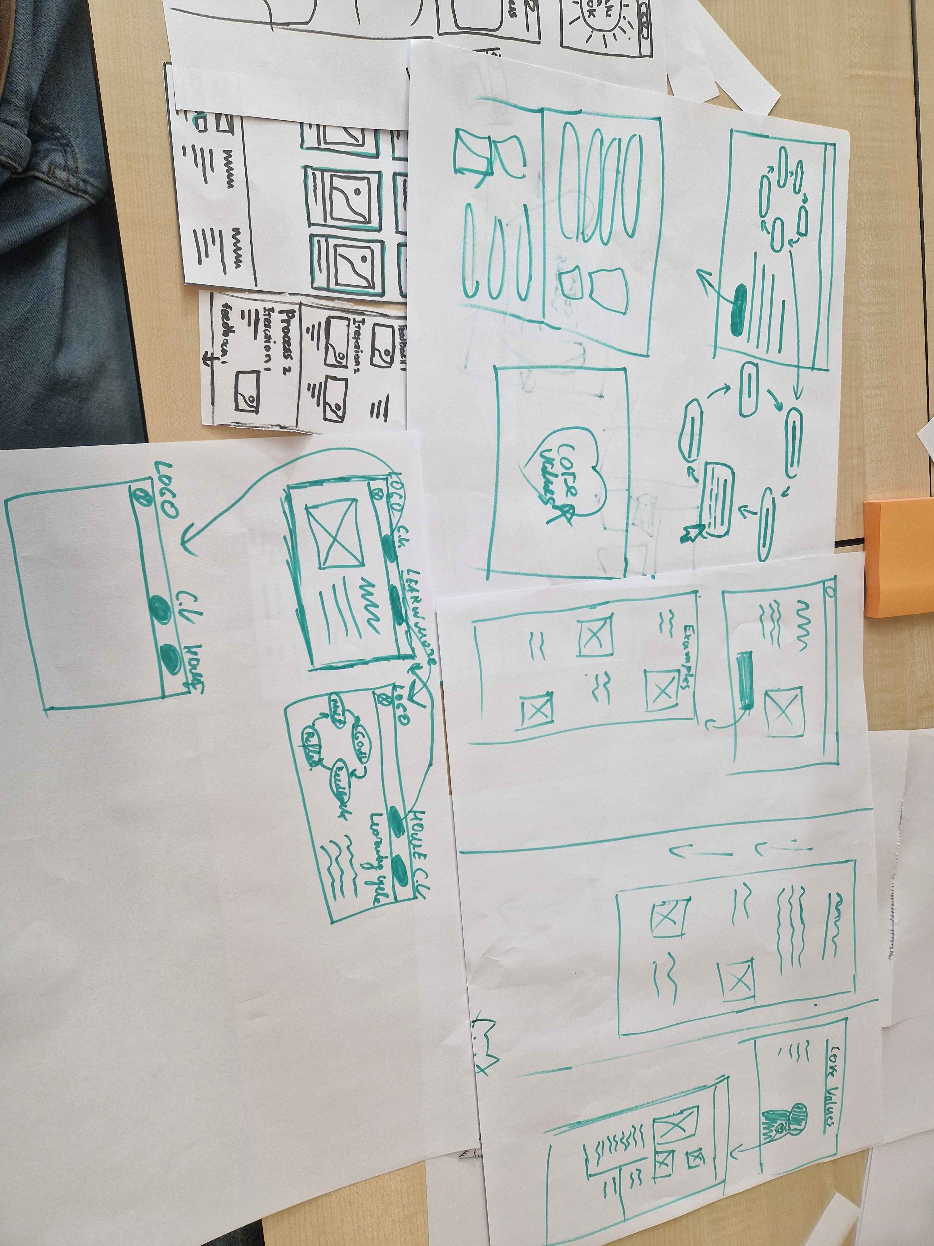
Iteration 1
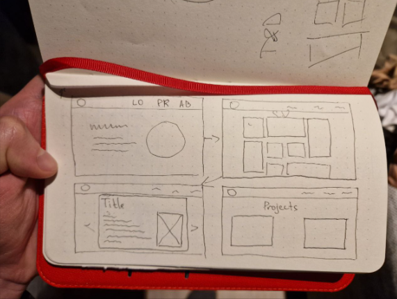
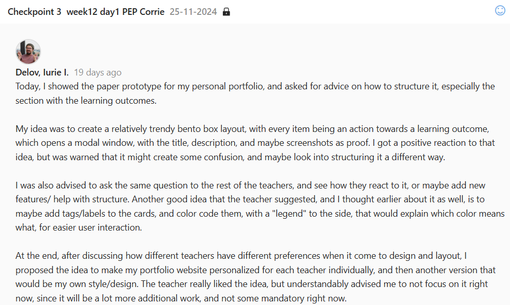
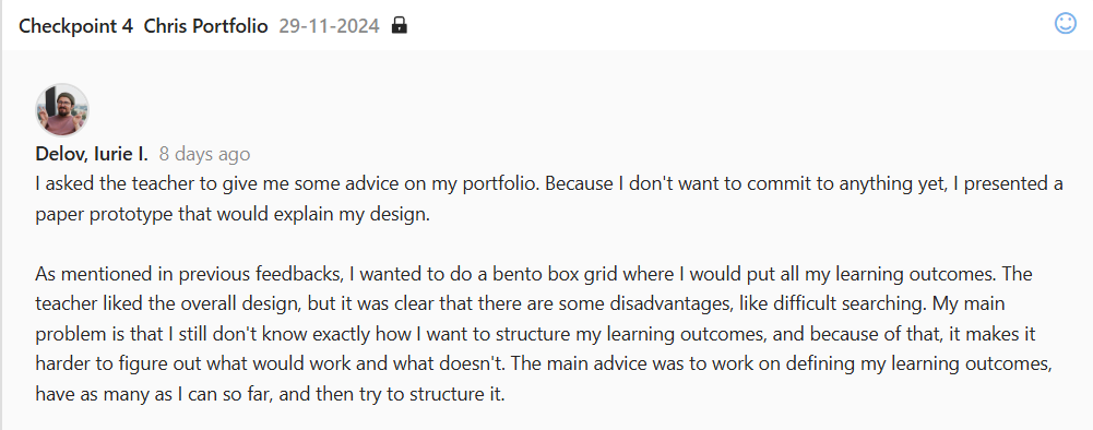
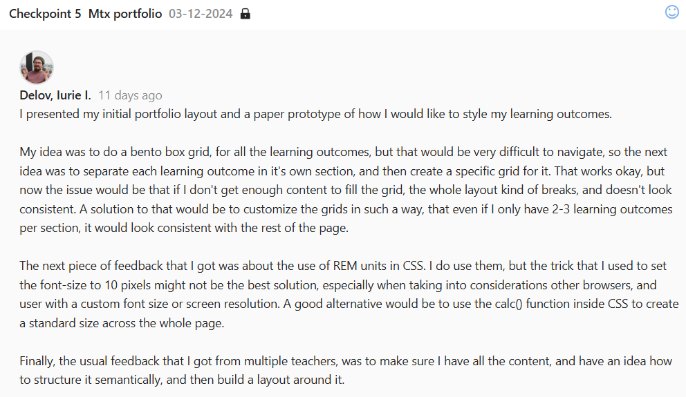
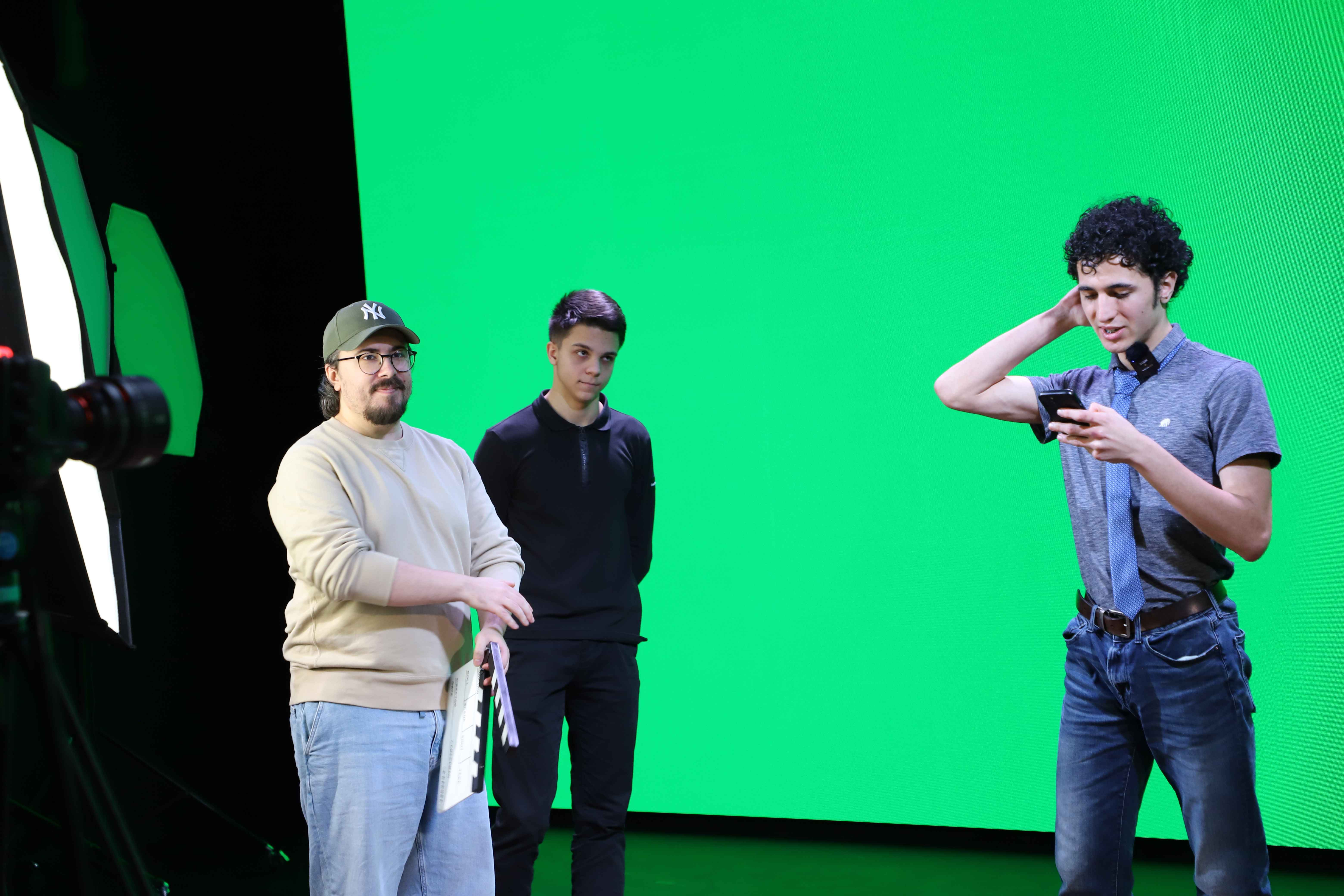
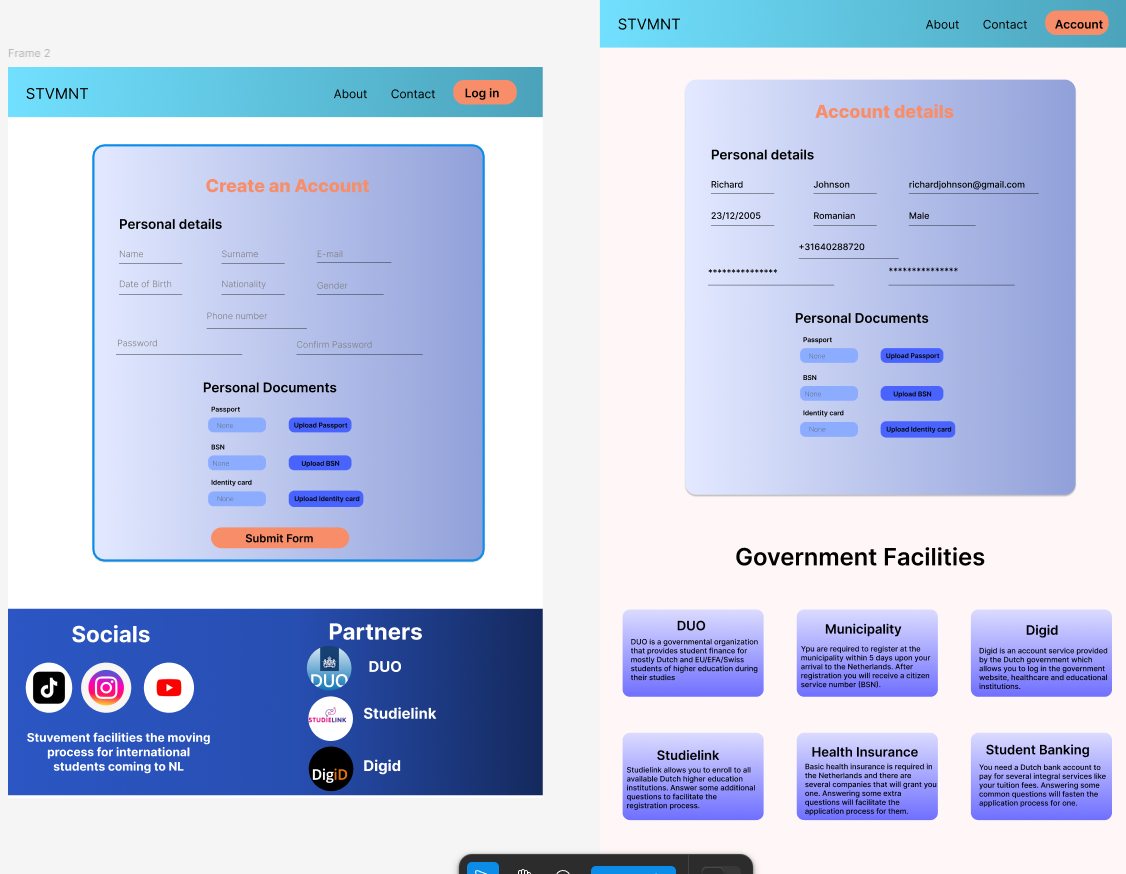
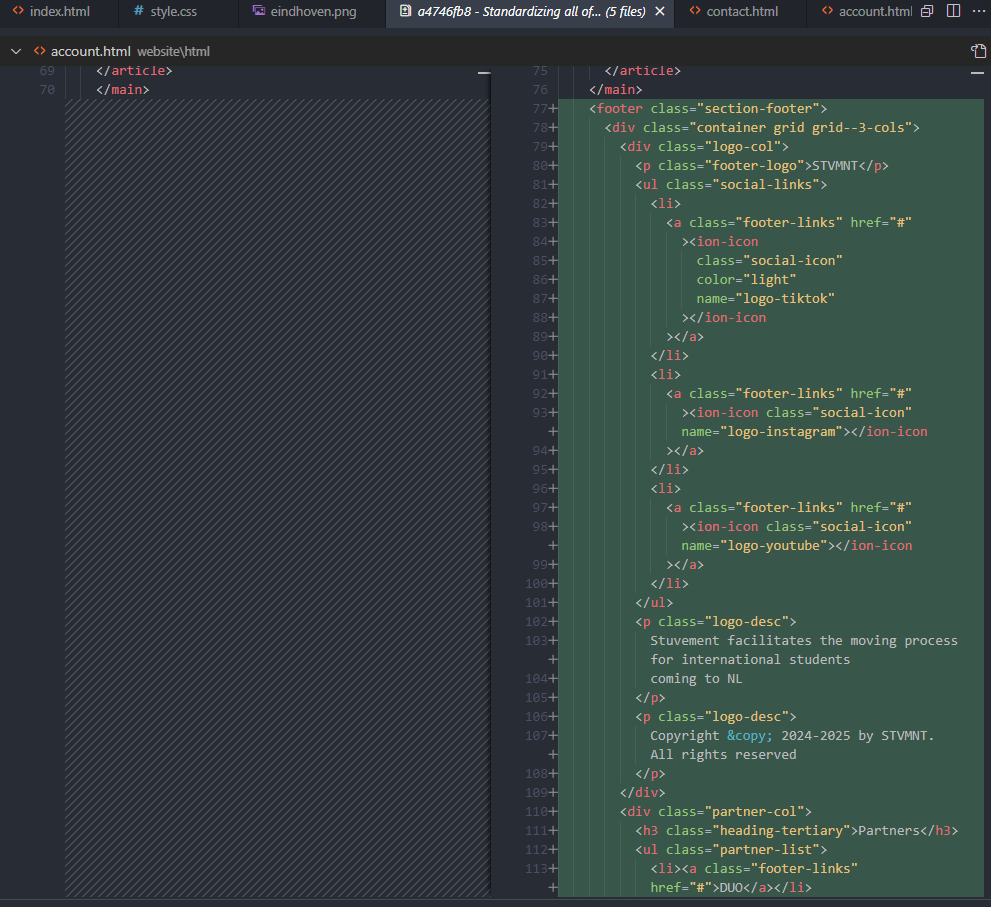
These are the initial paper prototypes that I presented to the teachers for feedback, to get a general idea and to better visualize how it’s going to look.
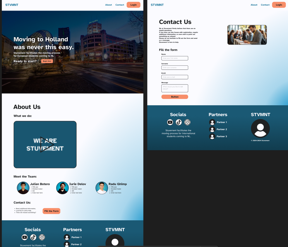
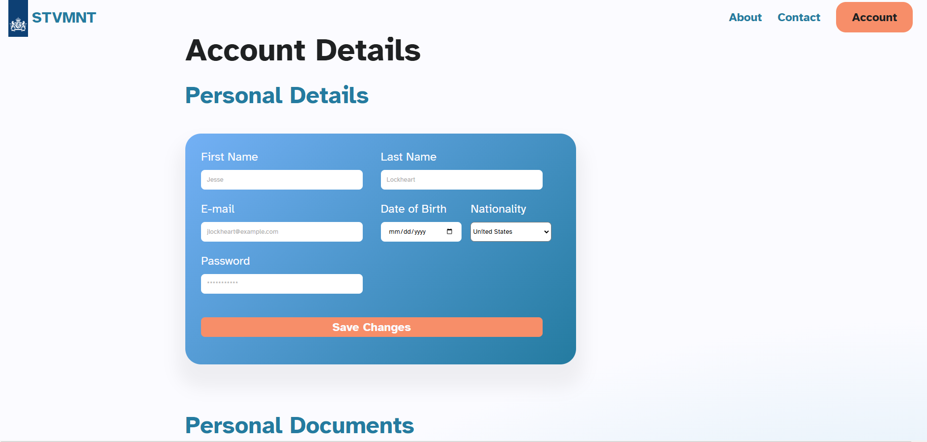
Iteration 2
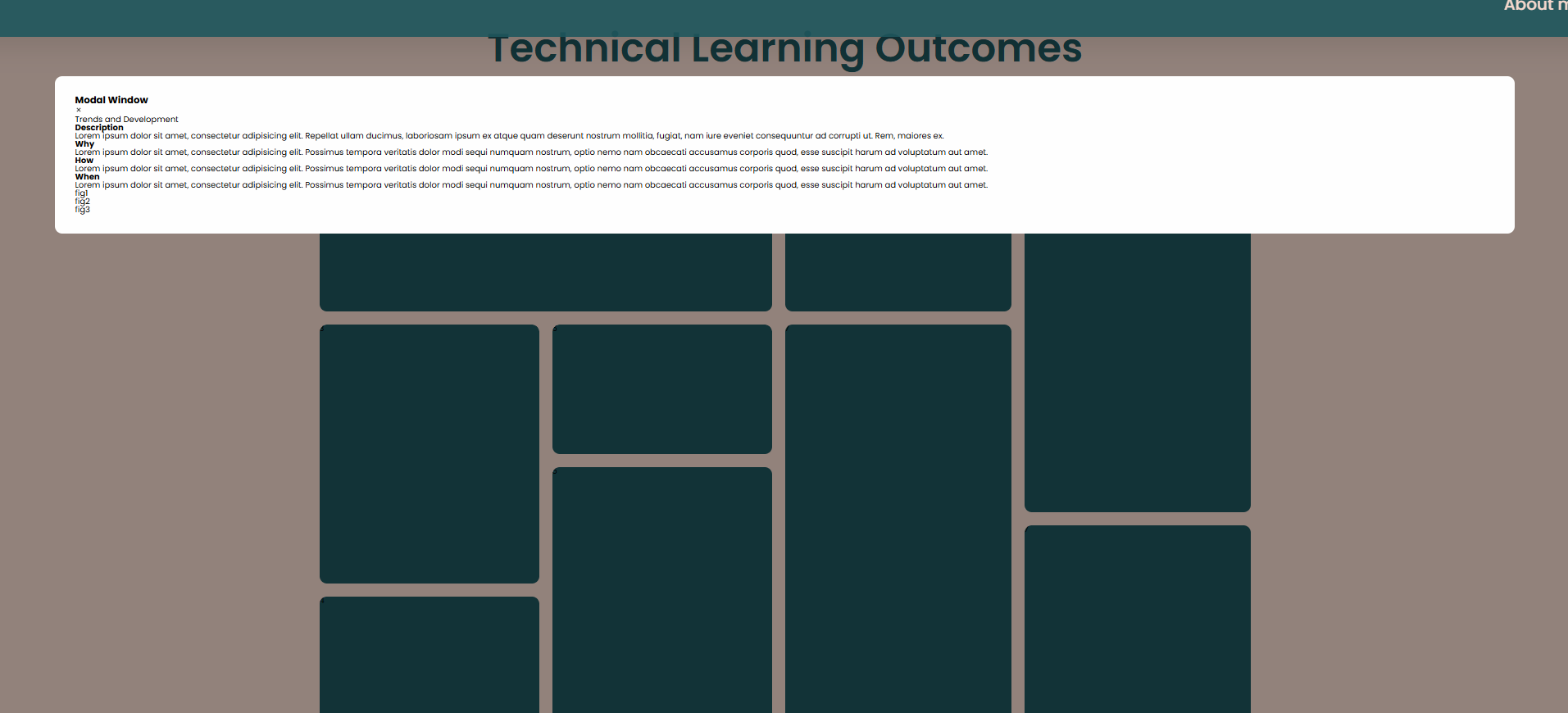
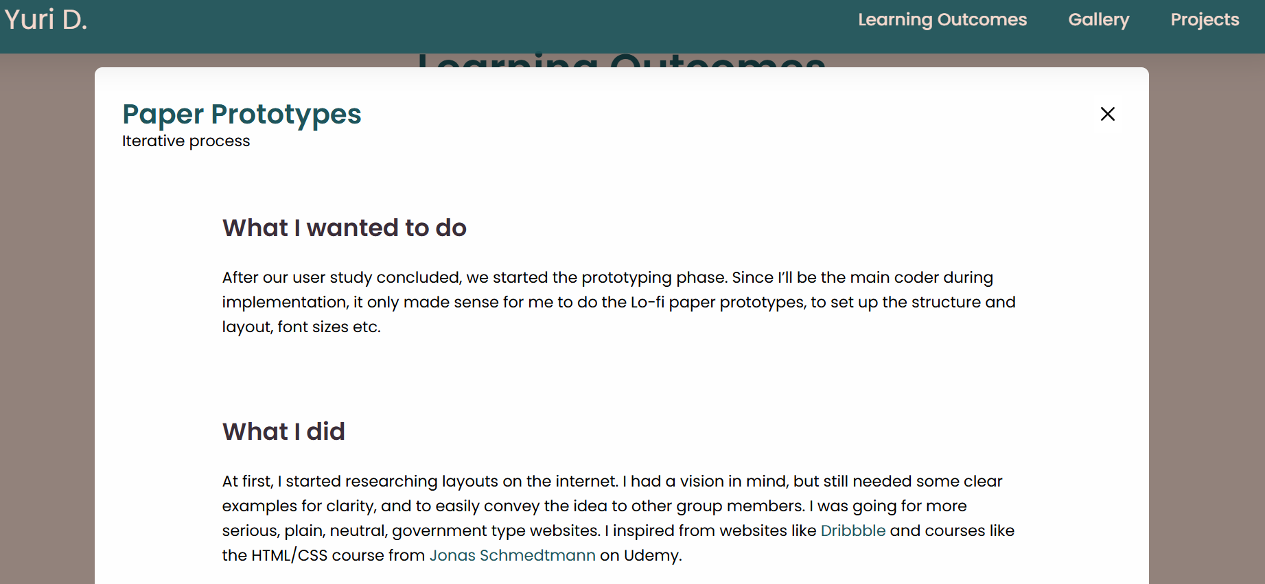
In these examples, I finished the basic layout, added a simple modal window, and added some general text to figure out how I would structure the content.

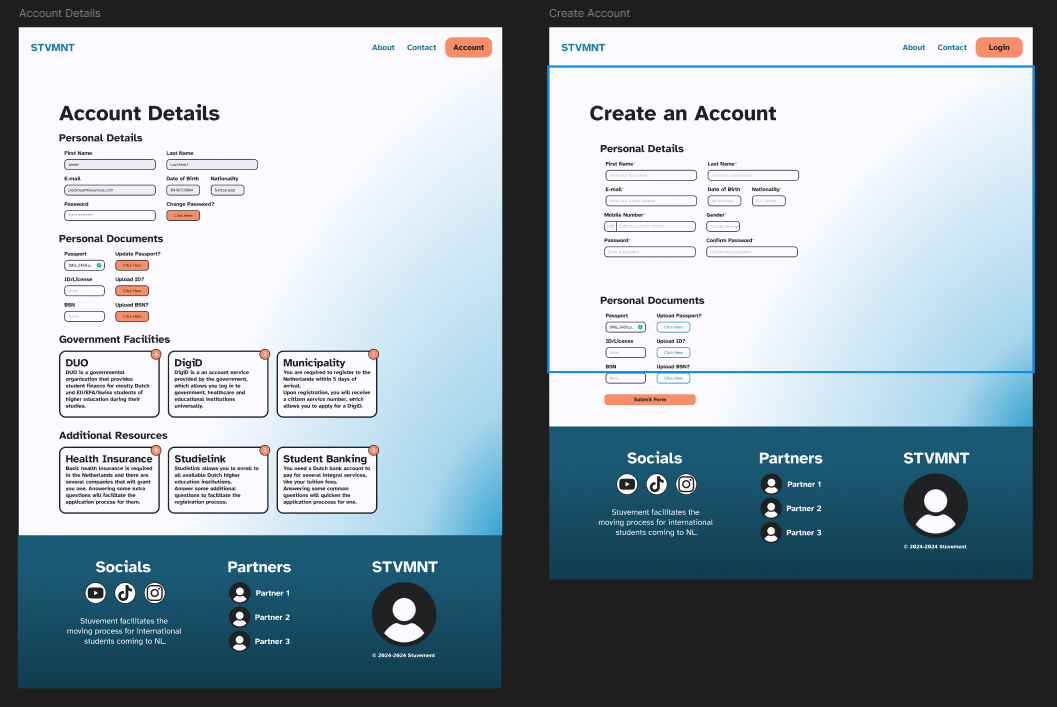
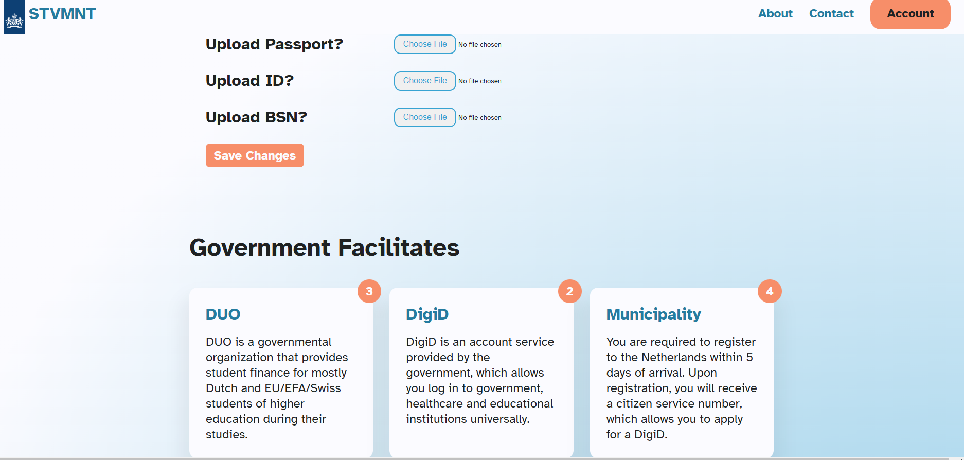
Iteration 3
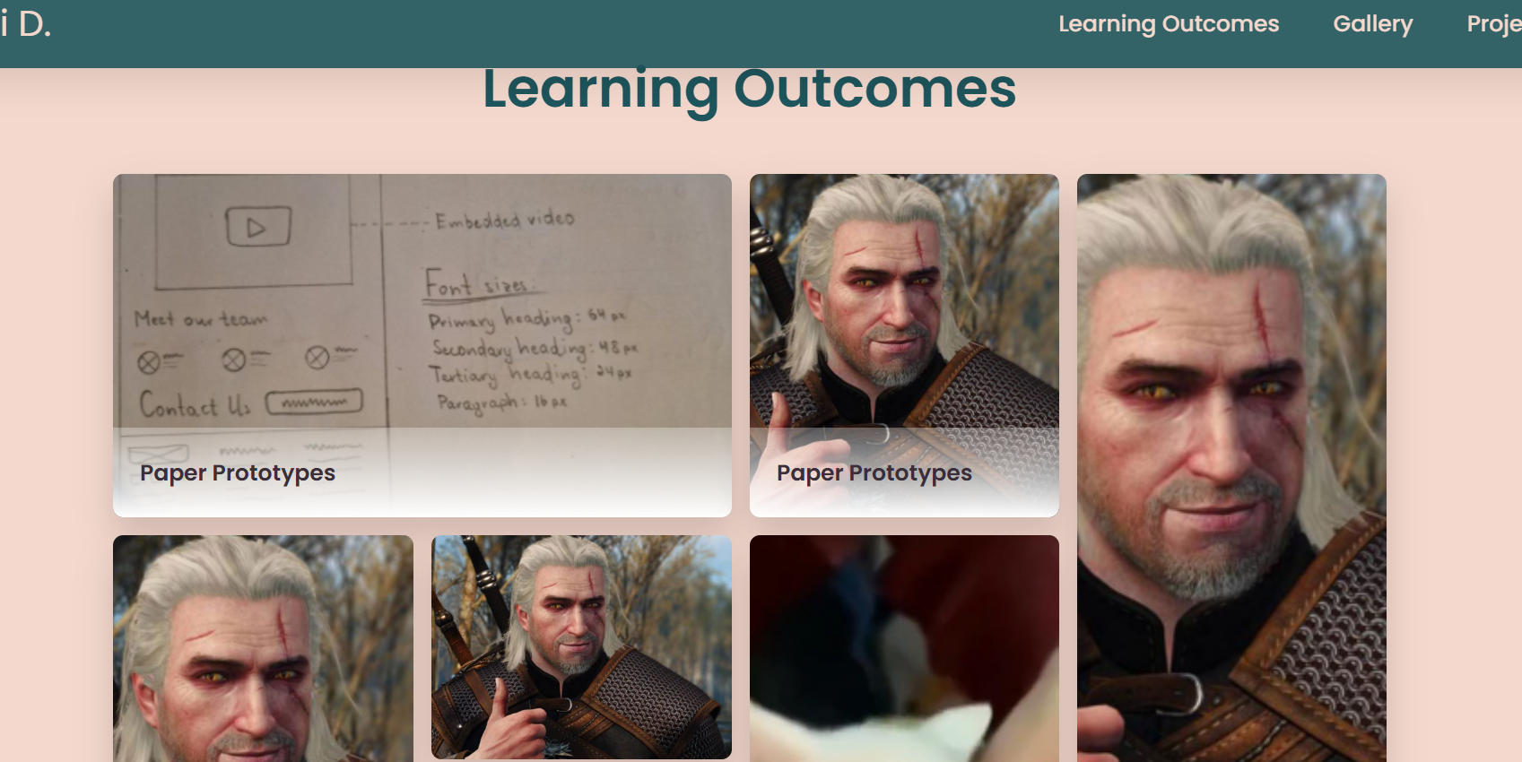
After numerous feedbacks from all the teachers, and even some from other classes, I added some placeholder images, added a title at the bottom of the cards, added a close button to the modal, and structured the content according to recommendations.
Feedback and Reflections
The road for this experiment of mine was pretty long. I got a lot
of feedback, from early paper prototype, to the almost finished
structure that I have now. Most of the teachers had their own
ideas of how this would look, and how to structure it.
Some thought that one grid with all the Learning Outcomes are
fine, as long as they are categorized, or color coded, but that
would be a nightmare to navigate and search for specific stuff.
Others, advised me to try to separate the LO’s and make smaller
bento grids for each LO, but that would mean to have very small,
broken down grids. Eventually, after some more advice, I decided
to separate the learning outcomes into Technical and Professional,
which you can switch with a button press (not finished yet).
I implemented some other smaller adjustments, like a title at the
bottom of the card, locked background on modal open, and small
pop-up animations for each card on hover. On key problem right now
is responsiveness, or better said, the lack thereof. While talking
to the teachers, I learned about grid auto-flow function, which
might fix my issues, and it’s definitely something that I’ll try
by the end of this project.
After finishing the general grid, and seeing how it looks, I can
clearly say that this may not be the best solution for this type
of content. Although pretty popular, this grid heavily relies on
visual aspect, and most of the information should be displayed on
the cards themselves, rather than having a lackluster thumbnail,
that you need to click to reveal the actual content. And
responsiveness is the biggest issue for my style right now. I will
try to get more feedback, but I think I’ll try to remodel it into
a Masonry grid that would solve some of these issues.


 \
\